Use colour as a key narrative, a fundamental component of your design process as you develop colour-led textile designs for fashion and art textiles.
“Colour can change how we feel, change how we view the world, reinvent the bland, provide spectacle and help us tell powerful stories. Colour will seduce us.” (Franklin Till Studio, Editor’s Letter. The Power of Colour.)
Colour can be culturally constructed, be reflective of our environment (natural or urban) or related to personal experiences. Textile, fashion and interior trend predictions produce colour rich forecasts based on the current and future zeitgeist.
For the 20th anniversary of the Hand & Lock Prize, we want you to use colour as a key narrative, a fundamental component of your design process as you develop colour-led textile designs for fashion and art textiles. Consider how, in visual perception, a colour appears to change depending on the colours that surround it. ‘Every perception of colour is an illusion…. we do not see colours as they really are. In our perception they alter one another.’ (Albers, J, Abstract Art, Anna Moszynska, Thames and Hudson 1990, p. 147). Explore and celebrate colour relationships within your own poetic colour statement.
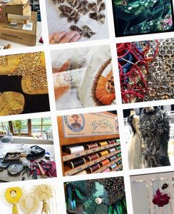
For this year’s Prize for Embroidery we ask you to become totally colour focused, real colouristas, and combine texture with colour to tell a story. You should:
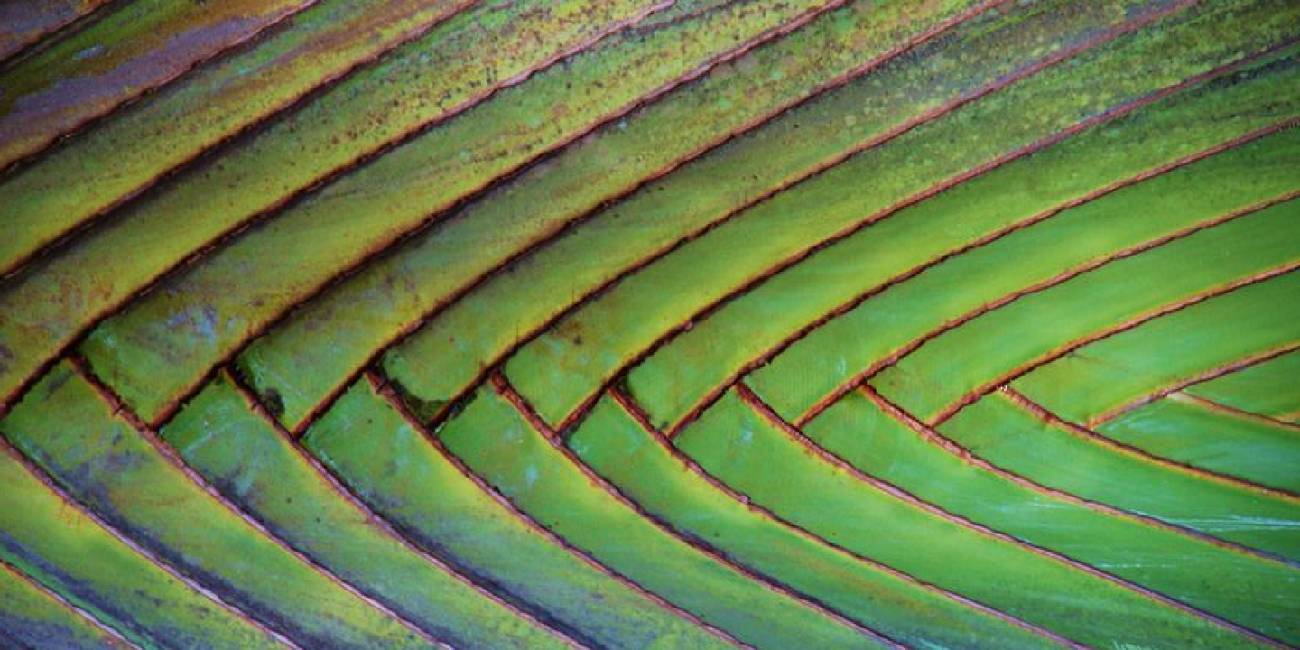
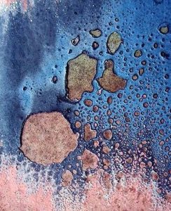
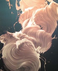
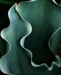
Experiment with primary, vibrant colour ranges; looking at art movements such as Bauhaus, Fauvism, Pointillism and De Stijl. Explore subtle, nuanced colour suggestive of calming, nurturing, harmony and tranquillity*. Reconnect with colours found in nature**. Create, using inventive embroidery, textures that enhance and enrich or contradict and counter your colour choices.
Create a colour palette meaningful to you at this moment in time, celebratory, and reflective of culture and history or your current or wished for environment. Whatever your subject focus, your entry should be a very personal colour statement.
This colour palette should be explored through the use of varied embroidered textures and surface techniques exploring varied materials, natural and/or synthetic related to your research. Experiment with colours found in your environment, create textures and embroidery materials out of coloured objects found in your periphery. Recycle, upcycle and invent anew. Reconsider the colour aesthetics of traditional embroidery techniques and challenge the conventions.
*Recent Pantone Colour Institute Colours of the year have reflected this: 2016 PANTONE 15-3919 Serenity and Pantone 13-1520 Rose Quartz.
**Recent Pantone Colour Institute Colour of the Year 2017, 15-0343 Greenery, is suggestive of Spring, renewal and associated with the ethos of sustainability and the desire to reconnect more to nature.
The Colour Futures Book
Viewpoint Colour | Issue 01/ Neo-Nature
Publisher David R. Shah, View Publications.
The Design Futures Book.
Viewpoint. #43 Spirituality. | Publisher David R. Shah, View Publications.
Editors Kate Frankin, Caroline Till
‘Experiment’
‘Explore’
‘Reconnect’
Or follow us on Instagram